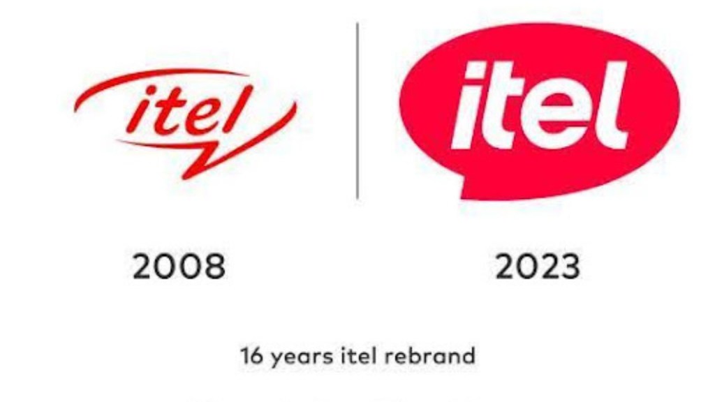
itel, a smartphone brand, has announced a shift in its brand identity with a logo rebranding.
As per the company, the 16 year chapter of itel’s global journey will now be characterised by a refreshed identity that reflects their commitment to innovation, customer-centricity and accessibility.
Talking about the brand’s new identity, Arijeet Talapatra, CEO, itel India, said, “After 8 years of successfully raising the technology benchmark in India, unveiling our new logo marks the beginning of a new era for itel. The vibrant Pinkish red color and modern design stand for love, passion, and energy and reflect the spirit of modern Bharat. While we remain dedicated to our purpose of ‘Enjoy Better Life’, this transformation is a bold step towards our unwavering commitment to innovation and customer-centricity in India.”
itel’s existing logo has served the company well for over a decade. The new logo is designed to be modern, vibrant and easily recognisable, capturing the essence of itel’s brand promise – “Enjoy Better Life”.
Additionally, the redesigned logo embodies itel’s dedication to innovation, reliability, and an understanding of the evolving needs of users, delivering a smart sophisticated ecosystem of itel products. The refreshed design reflects the brand’s forward-thinking approach while maintaining its core values of accessibility, quality and affordability.

