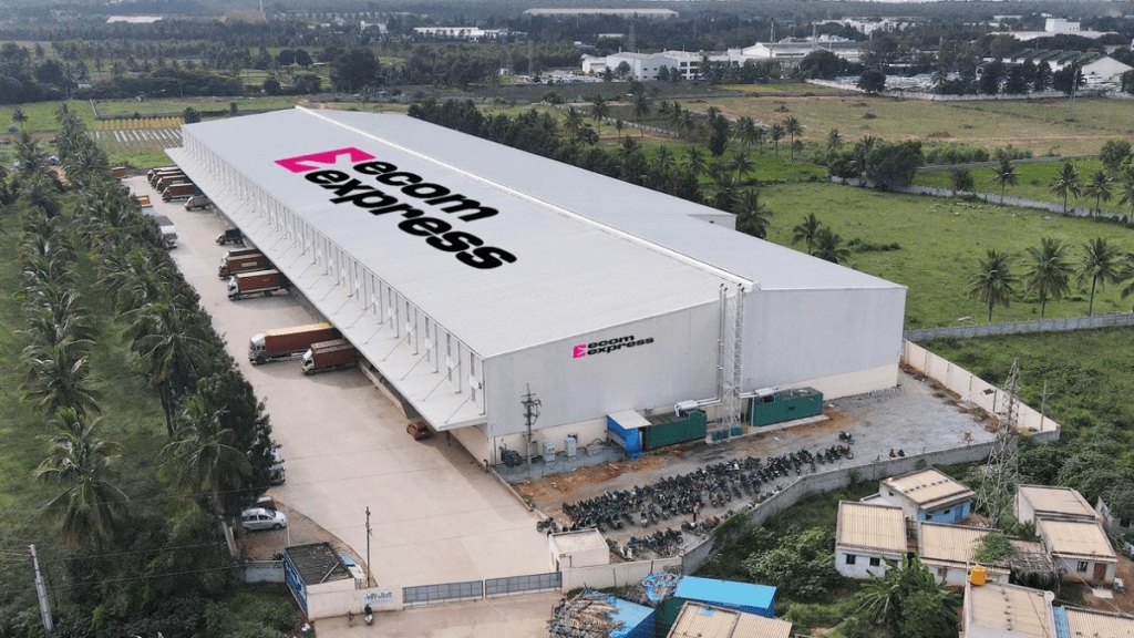
Ecom Express Limited, India’s pure-play B2C e-commerce logistics solutions provider, has introduced a new brand identity. This rebranding includes a new logo and visual elements that represent the company’s commitment to customer focus and technological advancement.
“Our refreshed brand identity reaffirms our commitment to a customer-first approach, integrating robust technology and innovation to deliver reliable, high-speed services. This transformation also reflects our dedication to our employees and delivery partners, aiming to redefine logistics and enhance the customer experience,” Ajay Chitkara, CEO and MD, Ecom Express, said.
The updated logo features a forward-moving arrow within a square and incorporates the letter ‘E’ to signify Expression, Innovation, and Progress, as per the company. The choice of magenta colour is intended to reflect the company’s values.
The rebranding effort is part of Ecom Express’s strategy to enhance its service across its pan-India express logistics network. The new identity aims to align with the company’s focus on meeting customer needs and integrating technology into its operations.
