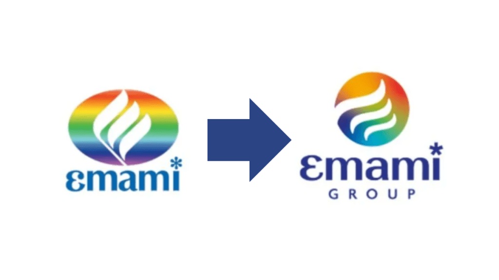
FMCG major Emami Ltd on Wednesday announced a revamped corporate brand identity as it completes 50 years since its founding. The rebranding reflects the company’s evolution from a homegrown consumer goods player into a diversified organisation with global ambitions, according to a statement shared with the stock exchanges.
What’s changed?
The refreshed visual identity includes a shift from the earlier elliptical emblem to a new spherical design, symbolising adaptability and international expansion. At the centre of the logo sits a stylised lowercase ‘e’, intended to represent reinvention, entrepreneurial spirit, and long-term progress. The updated colour palette and typography have been designed to convey a contemporary yet rooted aesthetic, signalling a blend of legacy and innovation.
“This rebranding marks a pivotal step in Emami’s evolution,” said Harsha Vardhan Agarwal, Vice Chairman and Managing Director, Emami Ltd. “Our new identity reflects who we are today, an organisation rooted in heritage but powered by innovation, diversification, and a global outlook.”
Group-wide rollout in coming months
The new identity will not be limited to Emami Ltd alone. Each of the diversified businesses within the Emami Group will adopt tailored visual systems derived from the core brand design. These include distinct colour schemes and modern typefaces that align with the group’s broader design language, while allowing for unique representation across verticals.
The rollout is expected to be completed over the next few months and will be visible across packaging, digital assets, and corporate communication channels.
Emami, known for its flagship brands in personal care, healthcare, and ayurvedic products, believes the refreshed branding will reinforce its positioning in both domestic and international markets and help deepen engagement with consumers, partners, and stakeholders.
