

Logos are integral to brand image and they are the face of a brand, they not only help us identify the brand but also play a huge role in attracting a consumer base. With alterations in brand image, vision and on-going market trends, brands as they mature often decide to re-design their logos. India has seen the emergence of some of the leading corporate companies since the days of liberalization, while some have existed since the colonial rule and are a legacy.
Many Indian brands over-time have decided to shred their old identity and have adopted a new one aligning with the contemporary ideas and ever-changing dynamic market.
From Nestle to Asian Paints, here are the old and new logos of some of our favourite Indian brands:
Asian Paints
In 1942, Champaklal H. Choksey, Chimanlal N. Choksi, Suryakant C. Dani and Arvind R. Vakil started India’s largest and Asia’a third most trusted paint company with the name “The Asian Oil & Paint Company”. In 1954, “Gattu” was created as a part of their logo by famous cartoonist R K Laxman.

After ruling hearts of millions of Indians for over four decades, in 2002, “Gattu” was removed as the brand mascot and replaced by gradient ribbons forming the initials of the brand. However, the font of the logo was kept the same.
Dabur
Dabur was created by Dr. SK Burman, a Kolkata based doctor in the year 1884. This homegrown herbal brand has been a cult favourite for decades now. The brand got its name from, “Daktar Burman”. The original logo of the brand had a banyan tree with the logotype. The tree is believed to be representing nature and protection.

In 2004, Dabur changed its logo but still remaining ‘rooted’ to its original style, the banyan tree still remains but has been made more vibrant. the tree trunk represents three people with their arms raised to form the branches. The brand is still relevant after 100 years of its existence with a strong consumer base and a billion dollar turnover.


Hero Honda
Hero Honda was created as a joint venture by India’s moped manufacturer and Japanese motorbike maker producing India’s first 100CC bikes that were easy to maneuver, affordable and weighed less as compared to others in the market. Hero Honda created a buzz in the market, especially among the youngsters.
However, the brand went through certain internal conflicts that led a tear in their relationship by the year 2001 leading to the ultimate separation between the two. In 2011, Hero Honda became Hero Motocorp and they created a completely new visual identity for them with a new logo thereby altering the brand image but still remains a nation favourite.
Hindustan Unilever
An Anglo-Dutch multinational company that secured a place in the hearts of Indians over decades. Born in 1933, Hindustan Lever had a bold typography in letter ‘H’ situated in a angular, dark green, growing leaves depicting the letters ‘LL’.
In 2007, the brand before its completion of 75 years in India, re-branded to Hindustan Unilever and donned a completely new identity with a new logo that had 25 different icons inside the letter ‘U’ that signify the organization’s diversity.
Nestle
It would be quite a task to find somebody who has not tried or grown up consuming Nestle products. From chocolates to instant noodles, Nestle has it all. Henri Nestlé’s original Nestlé trademark was based on his family’s coat of arms, which featured a single bird on a nest. After its trademark in 1868 Nestle logo has gone through a series of changes but the bird nest remains a constant.

In 2018, Nestle changed the colour of the logo and changed it into oak-brown giving it a more warm undertone.

Bajaj
Bajaj carved a niche for itself in every Indian’s mind with its infamous ad and “Bulandh Bharat ki bulandh tasveer, Hamara Bajaj!”. It created a strong base for itself in India with a range of products, founded in 1930 by Jamnalal Bajaj, this brand’s scooty was omnipresent in Indian households.
As new technologies started coming into the market, Bajaj restructured their marketing scheme and aimed to recapture its market share that was lost to Hero Honda. It came up with a new motif of a stylized ‘B’ with its logotype, all in blue.
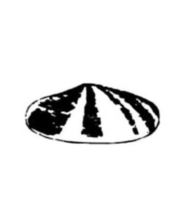
Shell
The Shell logo was simple and quite self-explanatory. Since its birth as a brand, the original shell comes from 1900, it was shaped as a scallop shell and it wasn’t until 1904 that we saw something recognizable to the present version.

s the brand matured and the trends changed there were significant changes noticed in the brand image as the logo was coloured red and yellow with smoother edges, distinct lines thus making it more attractive.
