

When Elon Musk took over Twitter, people anticipated that the platform will undergo changes but no one saw such “enormous” changes coming forth. Twitter is not just any other social media platform. It holds a certain history to it which people feel connected with. Now that the good old blue bird is free, we have “X” taking its place. But how did we welcome the blue bird?
Also Read: Twitter headquarter logo change was underway when Police arrived
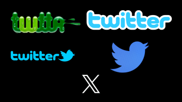
Interestingly, Twitter did not start off with a blue bird. The first logo looked anything but a bird. The first logo was of green colour and had bubbly-feel to it. This logo was never put to public use and one can surely deduce the reason by simply looking at it.
2006-2010
The first official Twitter logo aligned with the overall approach of the platform. The design was created by Linda Gavin. The logo was simple, had a rounded typeface, and blended with Twitter’s vision and focus. The sky-blue coloured logo lasted for almost four years before the bird arrived.
2010-2012
In 2010, the microblogging platform recognised their need to find something that would reflect the platform’s identity. This is when the bird appeared. The bird symbolised Twitter’s tweets- short, efficient, and quick. It has more to do with how a bird makes those short and sweet sounds. The blue bird found its position just beside the wordmark, to its right.
2012-2023
Then in 2012, the platform saw the need to refresh its image by focusing more on simplicity. By the time the company realised such a need, the platform had already created a considerable name for itself. Its popularity peaked so much that it was realised that the blue bird does not need the company’s name along with it. That is how twitter’s name was dropped from the logo and then we only had our little blue bird.
However, the bird was redesigned to make it more symmetrical and cleaner. When one looks through and compares the designs of the two birds, they will find stark difference between the two. The prior bird’s plumage was eliminated, and the wings were instead fashioned by three overlapping circles. They made the emblem larger and changed the colour to a darker shade of blue, which improved its aesthetic appeal, especially against the white backgrounds of web pages. Twitter’s brand identity was formed with this bird emblem, and it has since evolved into one of the most easily recognisable.
It was in 2012 that twitter embodies an identity that stayed not just with the platform but also with the community.
2023-
Now in 2023, the bird has been freed. As per the not-so-new Twitter head, Elon Musk, the new logo embodies “the imperfections in us all that make us unique.”
Also Read: Bye Bye Birdie: Elon Musk announces new “X” logo for Twitter, bids farewell to “all the birds”
In a series of tweets, Musk had announced that the platform would soon get a new logo and if a good enough logo is posted, they will make it go live like they did. It is a “rare thing” to receive a second chance to leave a lasting impression, according to Twitter CEO Linda Yaccarino. She emphasised how Twitter had a significant impact on how people communicated, and with X, the platform hopes to change the “global town square.”
While the bird stood true for all the “chirping” that went around the platform, it is only time that would tell how “X” would perform.
Follow FE Tech Bytes on Twitter, Instagram, LinkedIn, Facebook