Elon Musk has been in the news not just for his acquisitions and launches but for his outrageous posts, tweets and pictures — a reason why he is one of the most followed Twitter handles (134 million), and is able to garner attention and social media activity through his tweets.
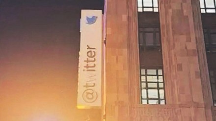
Known for his often controversial tweets that make him look like a rebel, freethinker, Musk has used Twitter to share, discuss everyday problems, politics, investment markets, business ventures, or random thoughts. Recently, the billionaire sparked off a series of reactions after his tweet showing the Twitter HQ sign in San Francisco without its ‘W’. The platform’s head office in San Francisco sported a painted-out W on its sign.
Some say this could be connected to his earlier announcement to change the company’s name from “Twitter” to “Titter”. Others mocked the word “Titter” and interpreted it as breasts, also said that the word is defined in the Cambridge Dictionary as “to laugh nervously, often at something that you feel you should not be laughing at.”
However, Musk said the new look was made because the landlord of the building had insisted that legally, the sign couldn’t be changed. “Our landlord at SF HQ says we’re legally required to keep the sign as Twitter & cannot remove “w”, so we painted it background color. Problem solved!”, tweeted Musk.
Musk has previously proposed the name change with a poll in 2022 asking followers for feedback on such a proposal. It was observed that more than 56% of the voters voted for Twitter to be named without a ‘W’.
The iconic blue bird logo got much attention this April when it was temporarily replaced with the ‘doge’ meme which was the face of a Shiba Inu dog. The ‘doge’ meme is well-known as the logo of the Dogecoin blockchain and cryptocurrency, which was created in 2013 as a joke to mock other cryptocurrencies like Bitcoin. It sparked off a wave of reactions from social media users.
Many thought this change could be in connection to the lawsuit filed against Musk by investors for his alleged role in the pyramid scheme for promoting Dogecoin. Others feel that it could be an April fool prank.
Even if such incidents sound shocking, they are yet another way to sensitise consumers about the brand, or spark a conversation. But many other examples of changed brand logos or identity can have a renewed impact. Creative yet contextual, most of the time, the communication is meant to be light hearted and fun, at the same time, it is important to give out the message in a manner that sounds interesting.
While Walmart logo has undergone several redesigns over the years, since its launch in Arkansas in 1962, Pepsi after 15 years launched a new version of its logo this year. It is the sixth redesign since the brand’s inception in 1898. The new logo will first be available on products in North America, when it will also mark Pepsi’s 125th anniversary. Globally, the logo will be distributed by 2024.
Nokia also changed its brand identity for the first time in nearly 60 years, complete with a new logo, as the telecom equipment maker focuses on aggressive growth. “We are updating our strategy, and, as a key enabler, we are also refreshing our brand to reflect who we are today: a business-to-business technology innovation leader pioneering the future where networks meet cloud,” Nokia said in a blog post attributed to CEO Pekka Lundmark.
